
Something pretty
A comfort-blue wallpapered rabbit hole to tumble gently into.

This post is so crammed with images that it should be read in the app or on a screen, as email will probably cut off the end of it. I should also warn you that it is a rabbit hole attached to many a warren, so if this is your thing, you may be down there a while. But it’s so pretty!


I’ve been on a looking-at-wallpaper kick for a while, probably as a bit of a break from my ongoing looking-at-fabric kick, and I thought I’d show you a rabbit hole I threw myself into head-first fell down lately. I fell in love with toile de jouy designs at an impressionable age, and while I’m not sure I’d like to live in a whole room decorated in toile, I’d absolutely love to stay in one. Beata Heuman does a dramatic version, Pierre Frey a gorgeous traditional, there’s a Liberty one and there are witty contemporary takes by Timorous beasties but the ones I really love are a riff on this idea of a pastoral vignette, more naif, more magical. If anyone knows what the official name is for this type of pattern, please share! (Bucolic naif perhaps?)
These designs are the ones I imagine a child looking at and daydreaming the rest of the story around them. They seem particularly apt at the moment, as my granddaughter and I have been reading stories laced with plenty of magical realism, and fantastical illustrations that require and invite our attention and imagination. Some of the ones below I found down the rabbit hole, and some I have known and loved for years. They come in many colour ways, but this warm muted blue - not pastel, not bright - is the colour I gravitate to in my clothes when I’m in need of comfort, the colour of old denim and the sky and calm water, and I notice I’m wearing a lot of it at the moment, so I chose it for this post because as we all know by now, I do love a theme.
I would love to muster the energy to wallpaper my hallway, and I have a fantasy of a small bedroom papered in Colefax and Fowler’s Snow Tree paper in the black colourway, with a dark green ceiling, so it would be like sleeping in a garden. I love seeing attic rooms covered in florals, sloping ceilings and all, or a bit of William Morris rioting over some proper Arts and Crafts panelling but I’m not sure if I would really like to live with wallpaper: I think in reality my love for pattern on fabric would compete too much with patterned walls, and it would just be exhausting because I’d never manage to restrain myself enough to show everything off perfectly. I don’t like the idea of a feature wall - I think if you are going for something you need to go all in - but an alcove, or an open cupboard, or indeed a hallway with a paper to make you daydream, that sounds enticing.
Anyway, on we go to the naif pastorals, or magical toiles, or storytelling bucolic, or whatever we are calling them.
I love this for a child’s room, and I love the name of it too: The Hidden Realm.
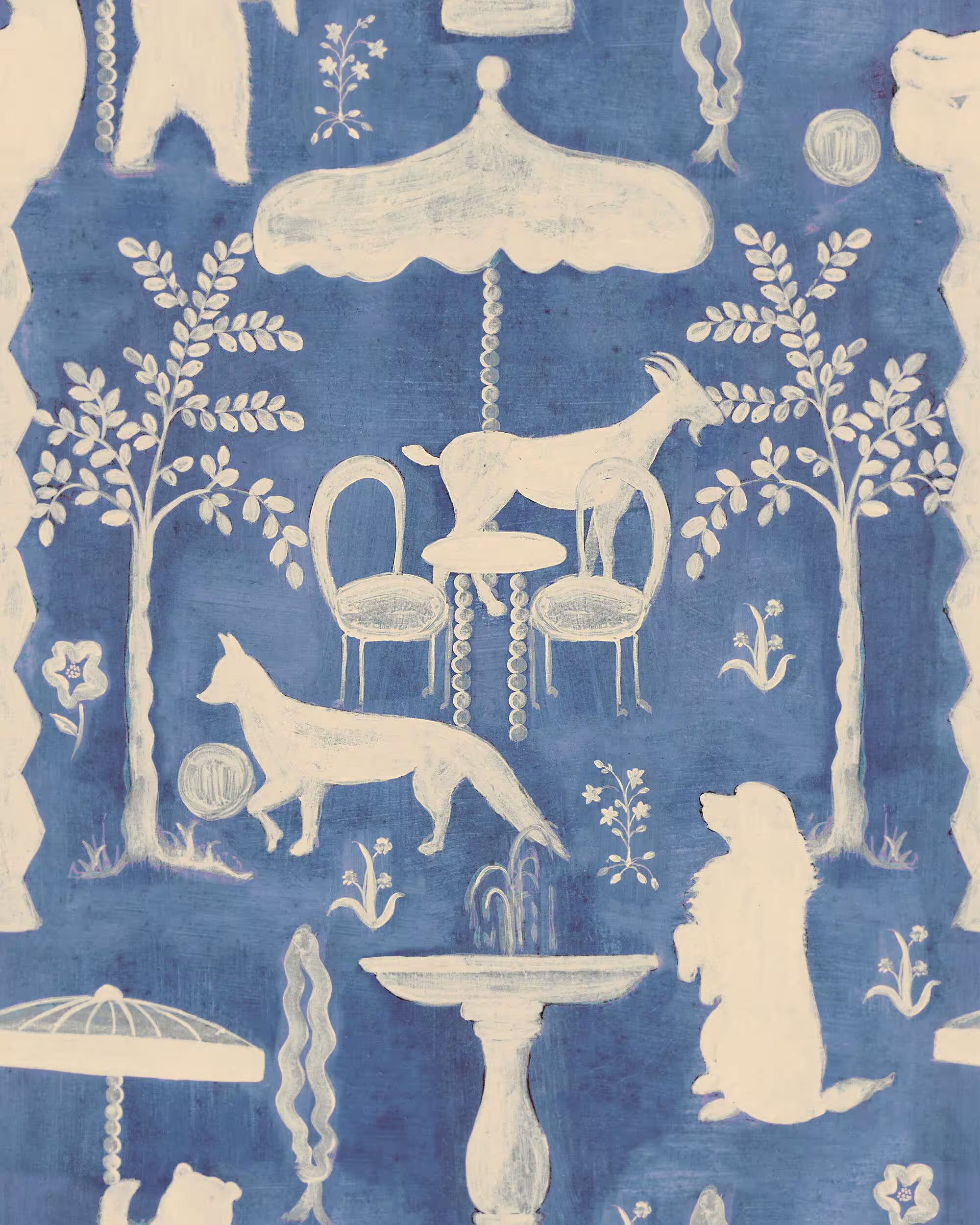
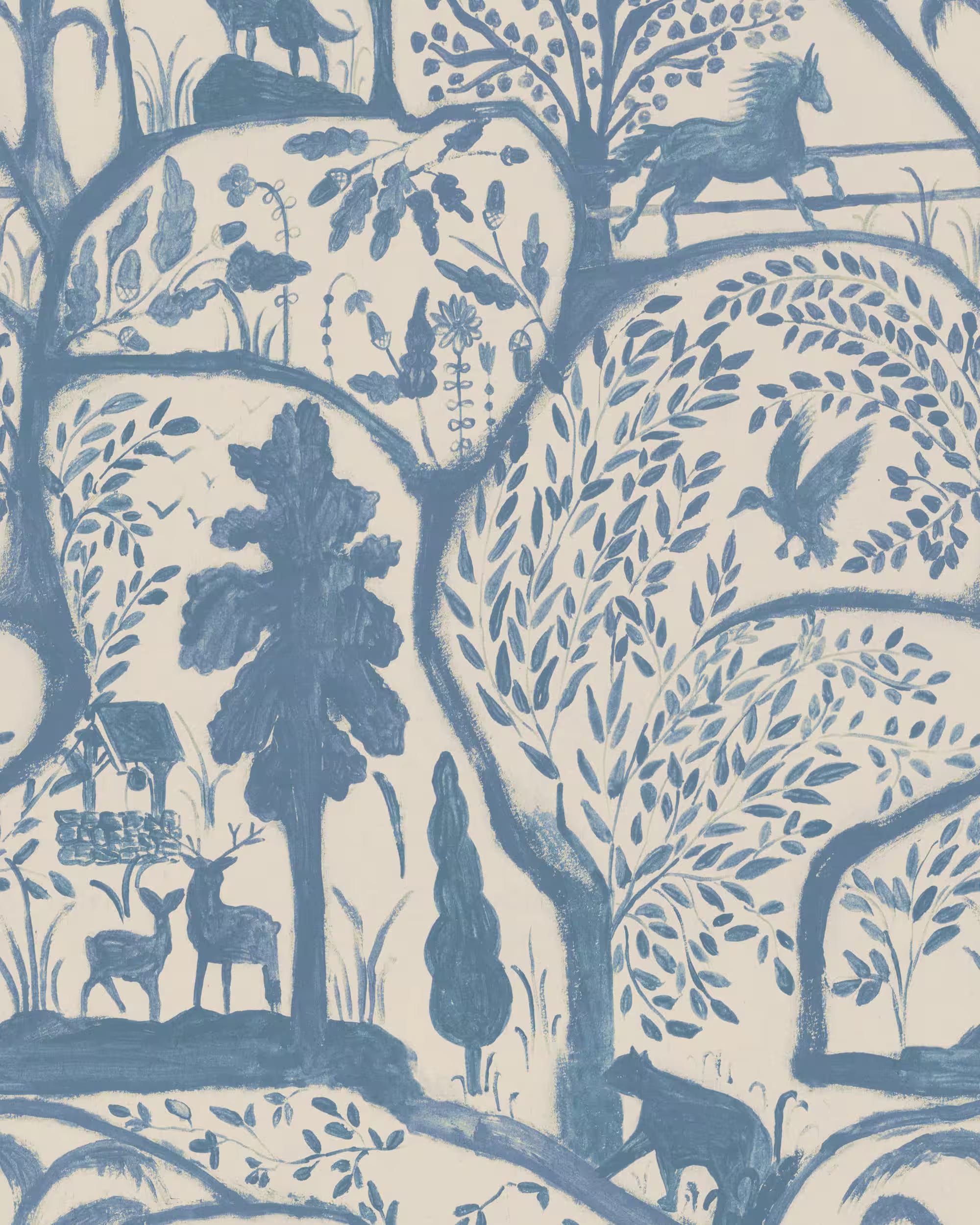
And this is one of my all-time wallpaper loves. They are both from one of my absolute favourite fabric and wallpaper design houses, MINDTHEGAP, which is based in Transylvania. Take some time to frolic here but if your taste is similar to mine I give you fair warning that you may be there some time. The wallpaper below is called The Enchanted Wood, and obviously it makes me think of The Little White Horse - a book with the best bedroom ever, incidentally - which is reason enough to love it. But even now, as an adult, there’s enough here to make me daydream.
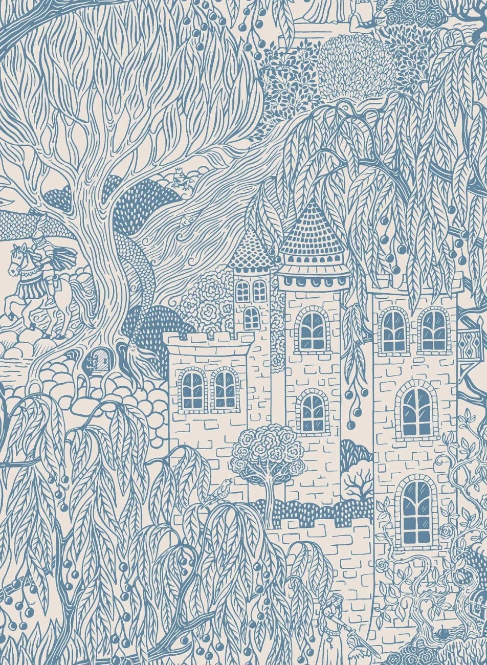
This one is called Kingdom of the Willows, from the Swedish brand Boråstapetar, purveyors of some very fine prints, and I have just discovered they have a website in English (I had always come across their designs through other websites). This pattern is pure fairytale, what with the knight on his horse, and the dragon, and the castle, surrounded as it is by enough rambling roses to do a few fairytales at once.
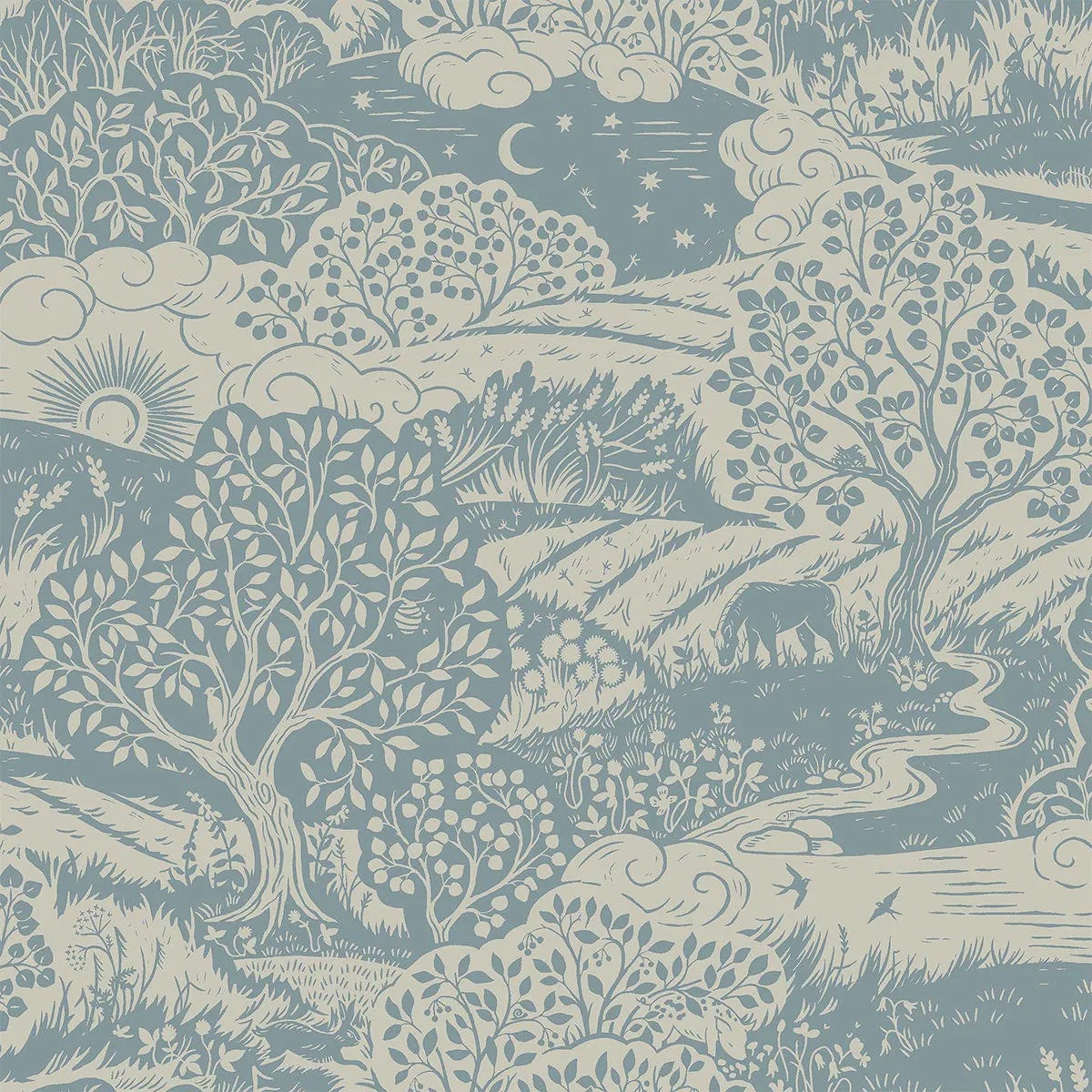
And this is also Boråstapetar. It’s called Solängen and while I just discovered it today, I’ve fallen in love. It reminds me of a particular view of the approach to the woods, and of being in the woods, and I just love it as a romanticised version of where I live.
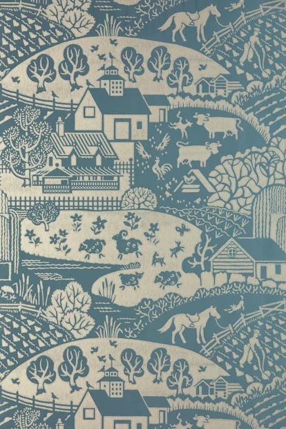
I think this, the Gable wallpaper from Farrow and Ball, is one of the ones that made me fall in love with the this kind of design. I love the tranquil little town, the farmyard animals and the field being tilled, the horse waiting to be ridden home, and those very bouncy sheep. These seems to me a perfect story-telling wallpaper, and I would love to be a child gazing at this as I fell asleep.
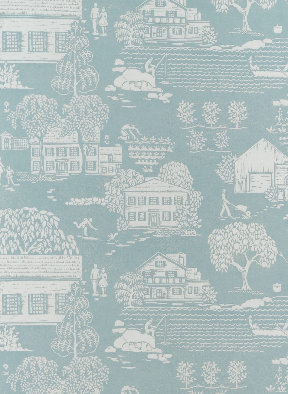
Down one of the rabbitholes I found this from Anna French, which is very sweet. Like many of the others, it shows up better in a darker colourway but this blue suits the peaceful subject matter.
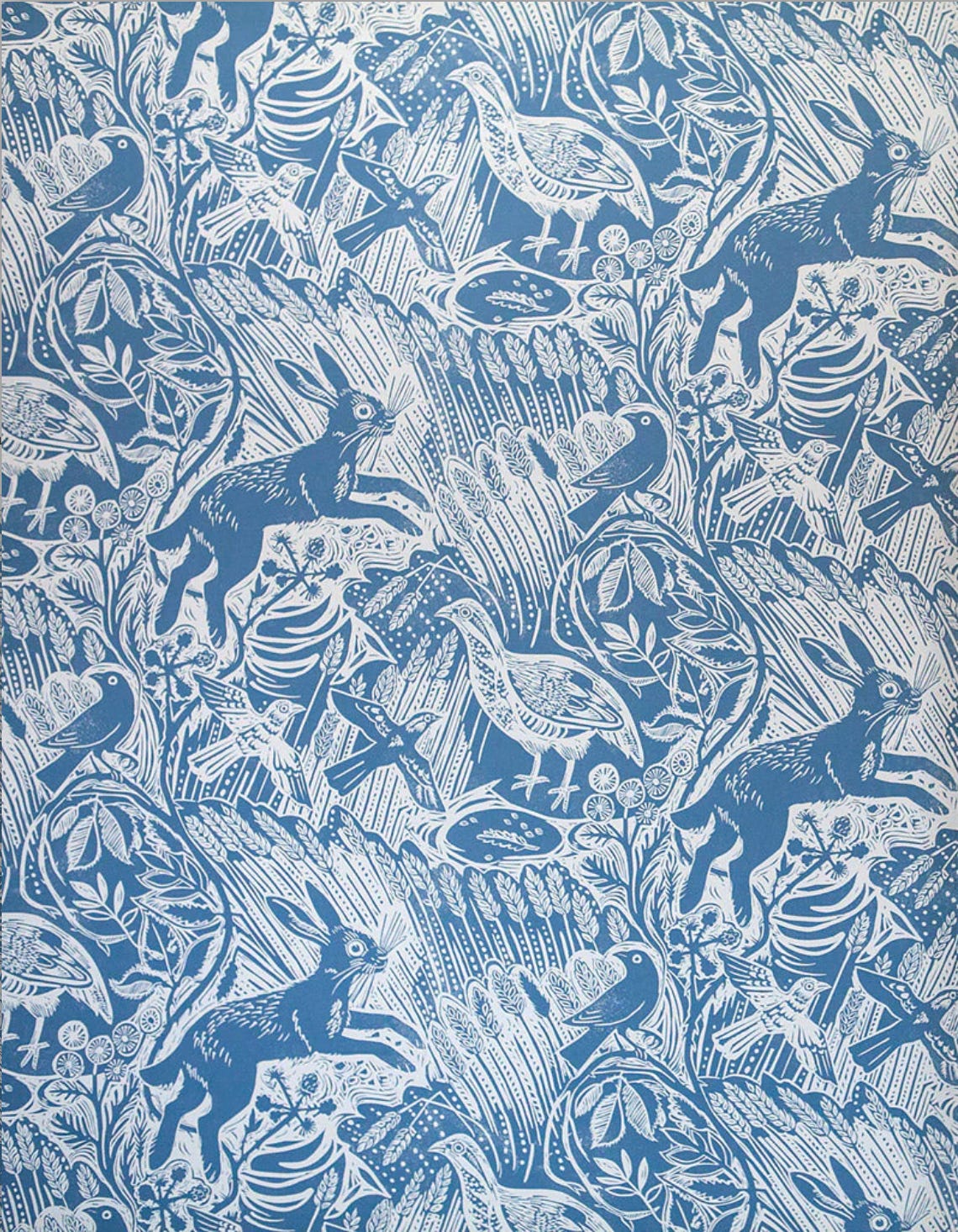
This is by Mark Hearld and it is such a beautiful piece of art, it just gives me joy to look at it. He is a master at this kind of print, and he just makes me want to live in this field.
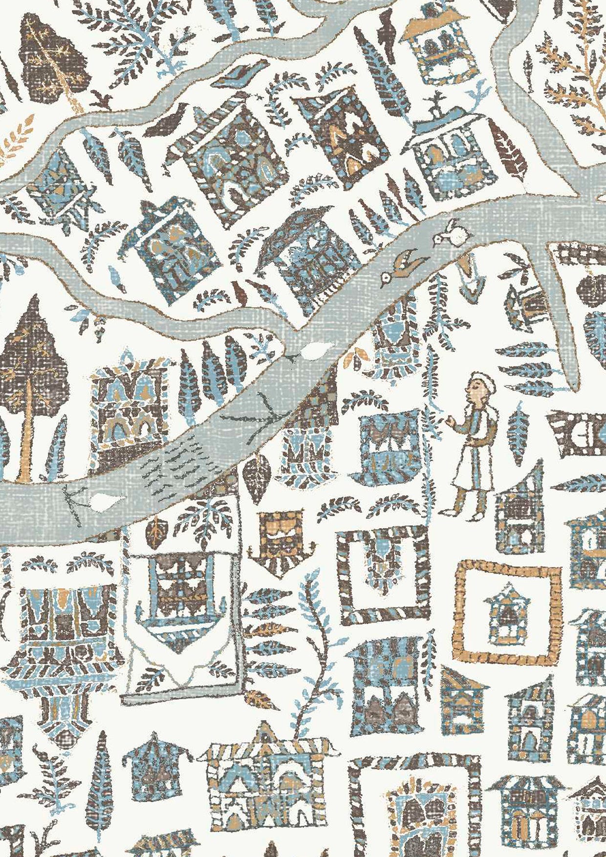
Although this is slightly different, based as it is on a shawl, this Lewis and Wood paper lends itself beautifully to story-telling and day-dreaming.
And let’s end with this, Edward Bawden’s Tree and Cow. This is the original, and only, colourway, and it reads like the starting point for many of the others, who took the idea of the repeating fields and trees and livestock, and told their own stories by adding to this perfect frame for ideas. But it is beautiful as it is, as well, sitting waiting for the viewer to pour their own imagination into it.
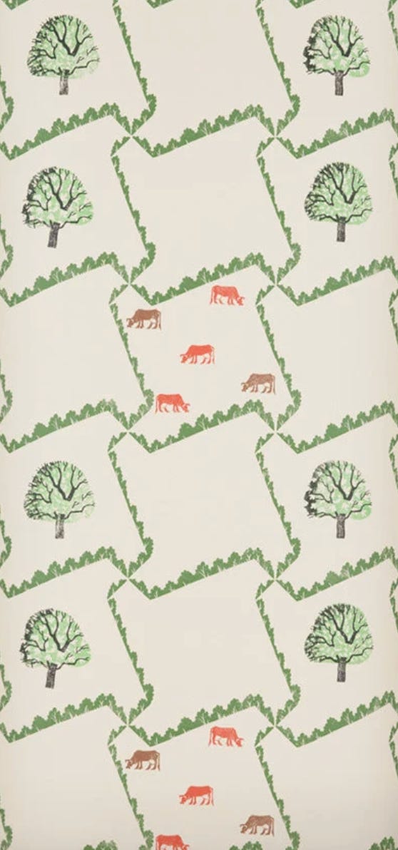
The Mark Hearld and the Edward Bawden are sold through St.Jude’s, which features the most incredible print designers and artsts, including Angie Lewin. Once upon a time not so long ago, printing was my thing, and it will be again, and these are the artists I am in awe of. Shoutout here to my favourite print gallery, Bankside Gallery in London, right next to Tate Modern. St. Jude’s also has an online gallery.
Here are some of the wallpapers mentioned at the beginning.


Beata Heuman, GP&J Baker x Kit Kemp, Pierre Frey, Timourous Beasties, Colefax and Fowler, Liberty.
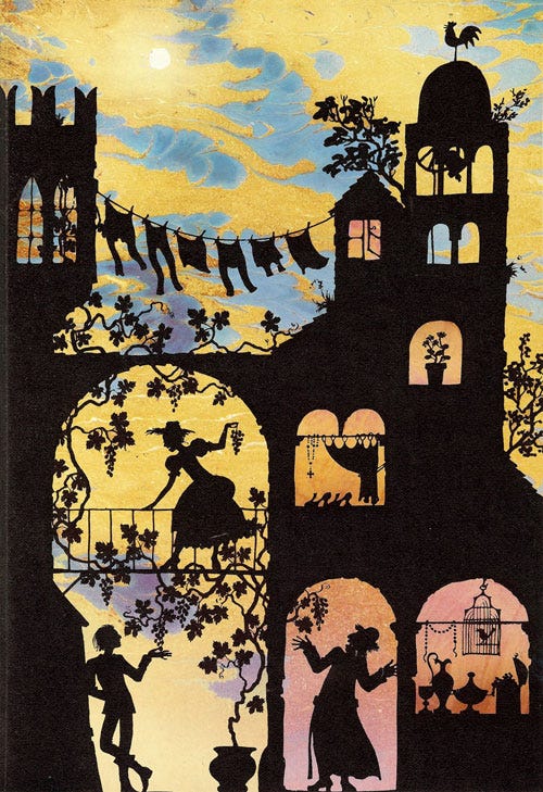
Imagine a wallpaper like this Jan Pienkowski illustration
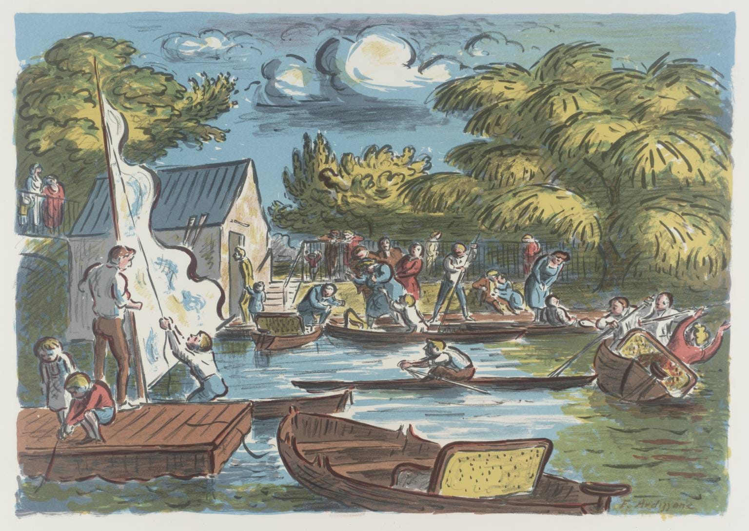
or this by Edward Ardizzone!
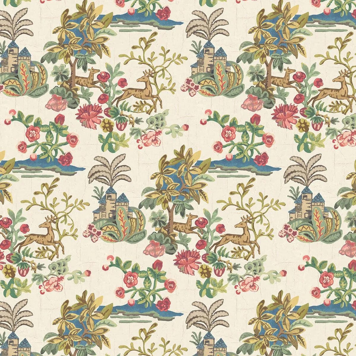
And if you wanted to fall down the more colourful rabbit hole than my restful blue one above, this GP&J Baker x Kit Kemp collaboration would be a perfect place to start.
And here I will stop, because otherwise I won’t be able to.
Gorgeous!! Off topic but the Jan Pienkowski reminds me of the cover of my copy of I Capture the Castle which is my favourite ever!!!
ps: I had not come across Kit Kemp before this summer, when I went to the Winchester literary festival and she was interviewed about her new book. The colours!! No surprise that you love her, too! 💙🩷💛💚